Exhibition Logo
Hi Everyone,
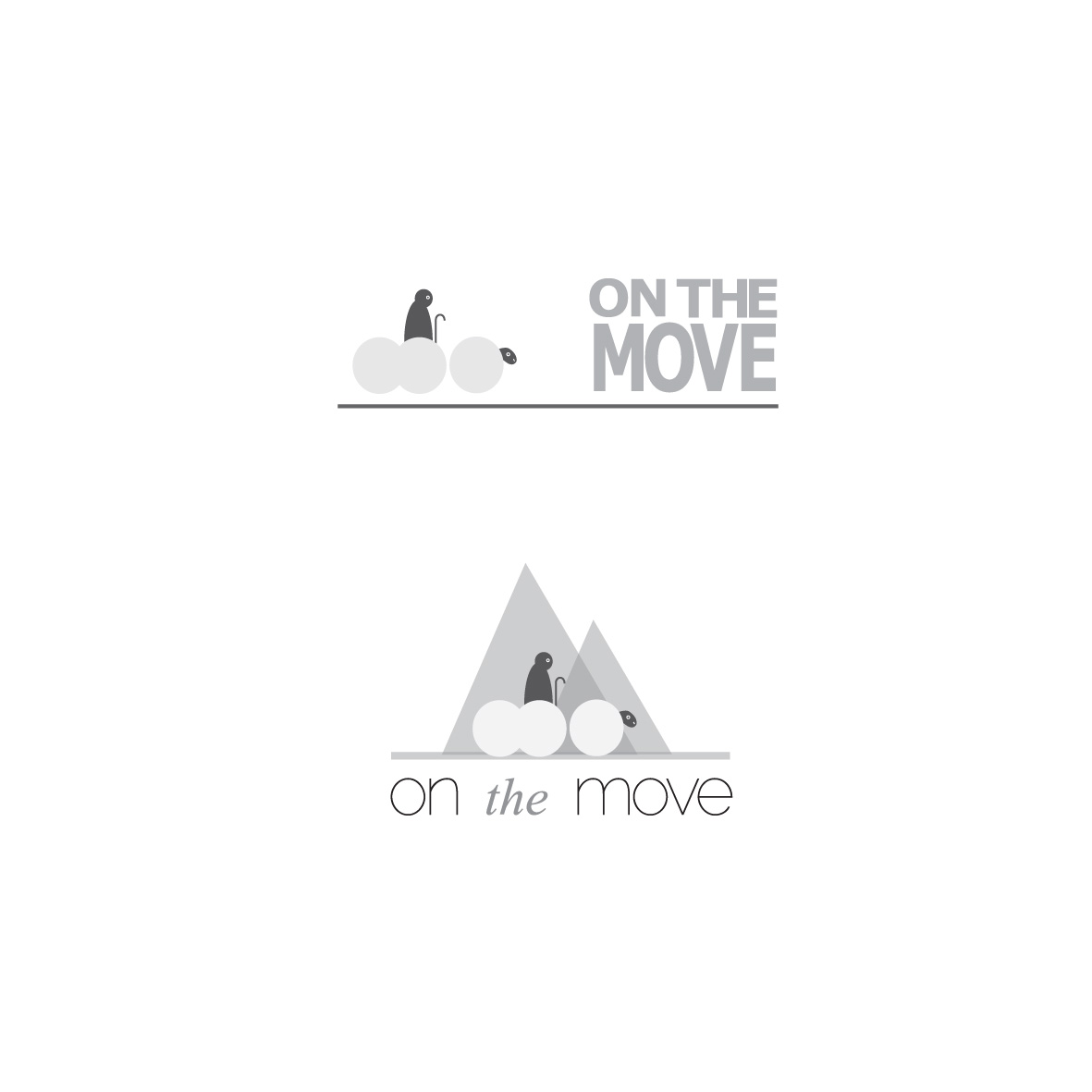
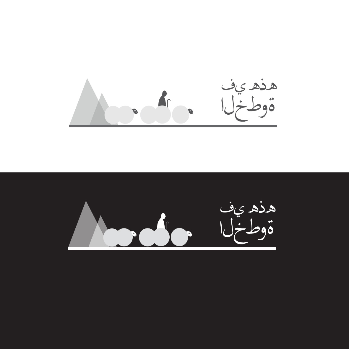
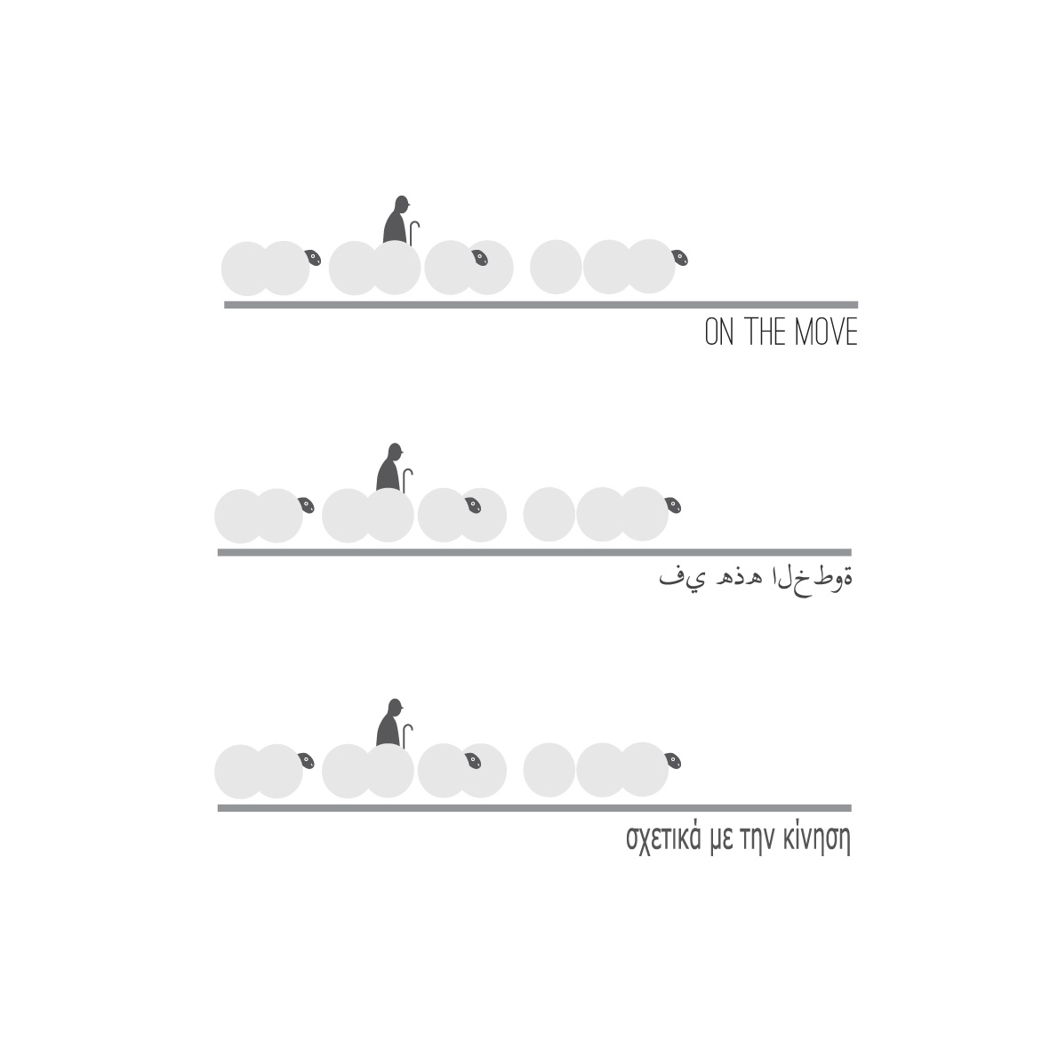
We thought we’d share with you the evolution of our On The Move logo!
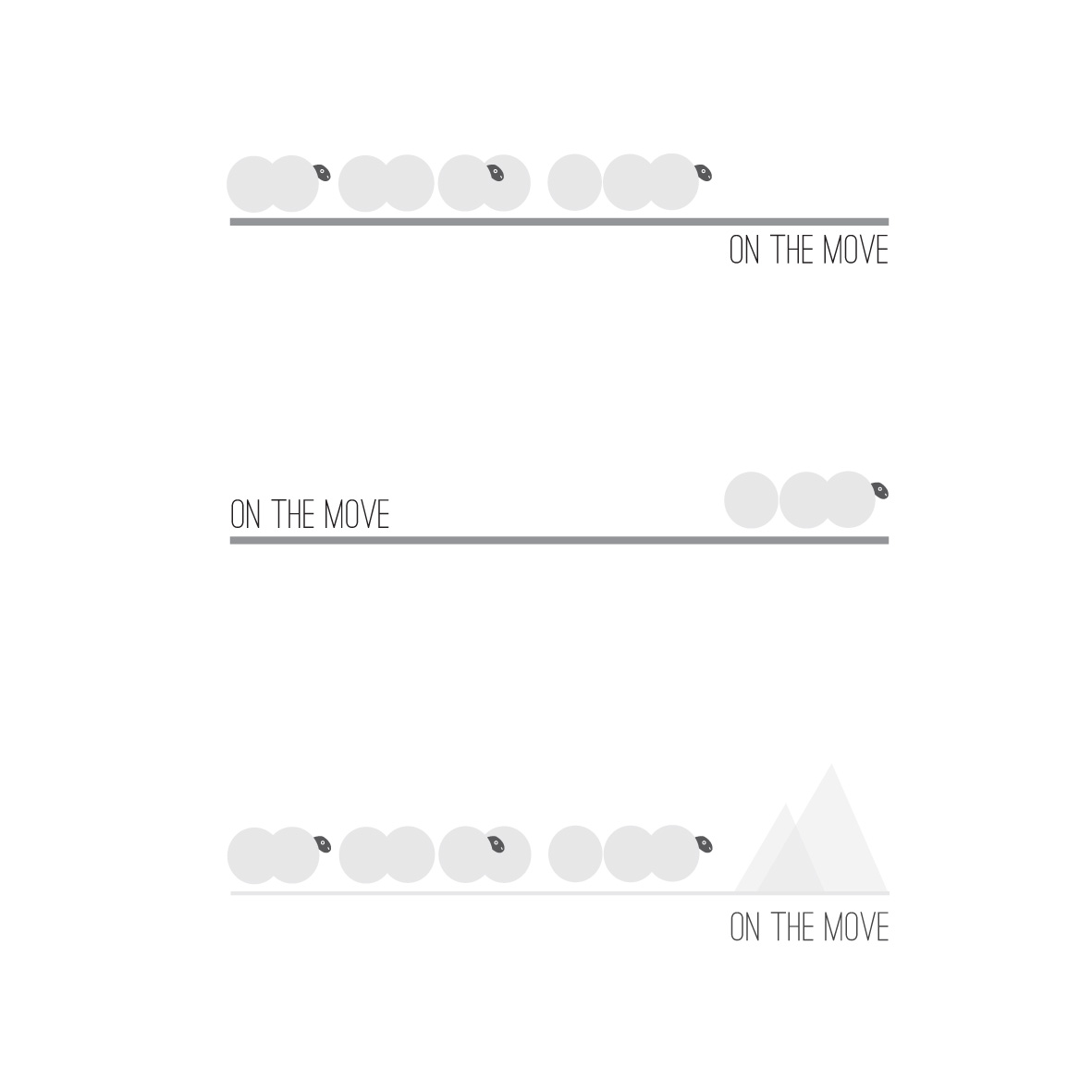
The main thought behind the logo design, was simplicity and elegance while illustrating the theme of the exhibition. Visual elements from the logo itself could be used throughout the exhibition, for example: the grey line being used for emphasis, or the light grey circle being used for numbering/ bullet points.
We are in the process of finalising the logo and look forward to sharing that with you very soon!